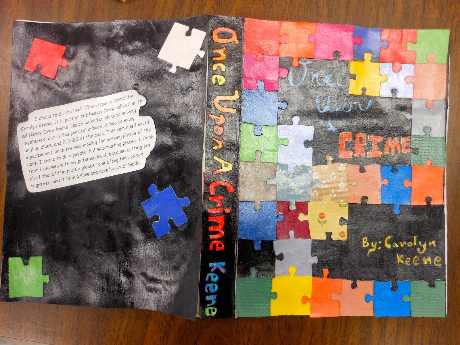
My students were asked to come up with a new cover for one of their favorite books. I started them off with a lesson on typography and layout, and let them run from there. They had a choice of colored pencil, paper layering or collage as their materials. My 8th graders just love open ended projects! Instead of the classic book description on the back cover, I had the students include their artist statements.
Sorry for the shiny photos. Some students used mod-podge to give their book cover a glossy look
Charlotte's Web creator used newspaper words to create a web, which symbolized Charlotte's use of words taken from newspaper in the book
One of the only students who decided to do the inside folds as well :)
I encouraged my students to create a layout that flowed well between the front, spine and back portions of their covers. If you're interested in trying this project in your class, here are the dimensions I gave my students for creating the different components of the cover. Fit standard book for display :) Add extra inches to the length (20") if you want your students to have extra space for practice. I left this a choice for my students.


Just found your blog after you commented on mine! You have some great ideas here! I love this book cover idea, might simplify it since I teach primary, but wow! awesome work!
ReplyDelete